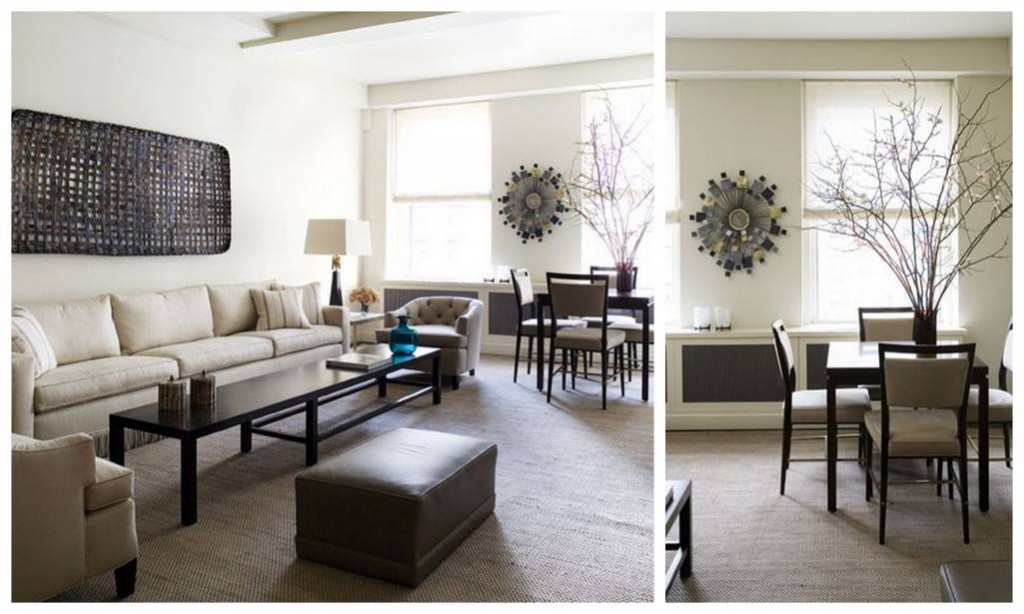
Every time we talk about women..right? What they like, what they wear ? What color they like to have in their house? But how about men? Have we ever wondered to find out what they like and what kind of designs they like when it comes to interior designing. Men and women has their own style of life and different tastes towards designing. Consequently there are lots and lots of differences when it comes interior designing specially man dominated premisses.
Pic via; ronmarvin
It is a known fact that house or apartment interiors are a manifestation the nature of their owner. Obviously it is natural any bachelor’s taste of interior will be totally masculine than normal basic interior. As an example can you ever imagine a room with peach wall color or wall paper, lace curtains, silk comfy bedding with some flower arrangements around will be a bachelor’s or masculine bedroom.
Pic via; ronmarvin
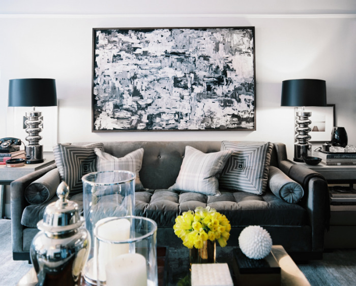
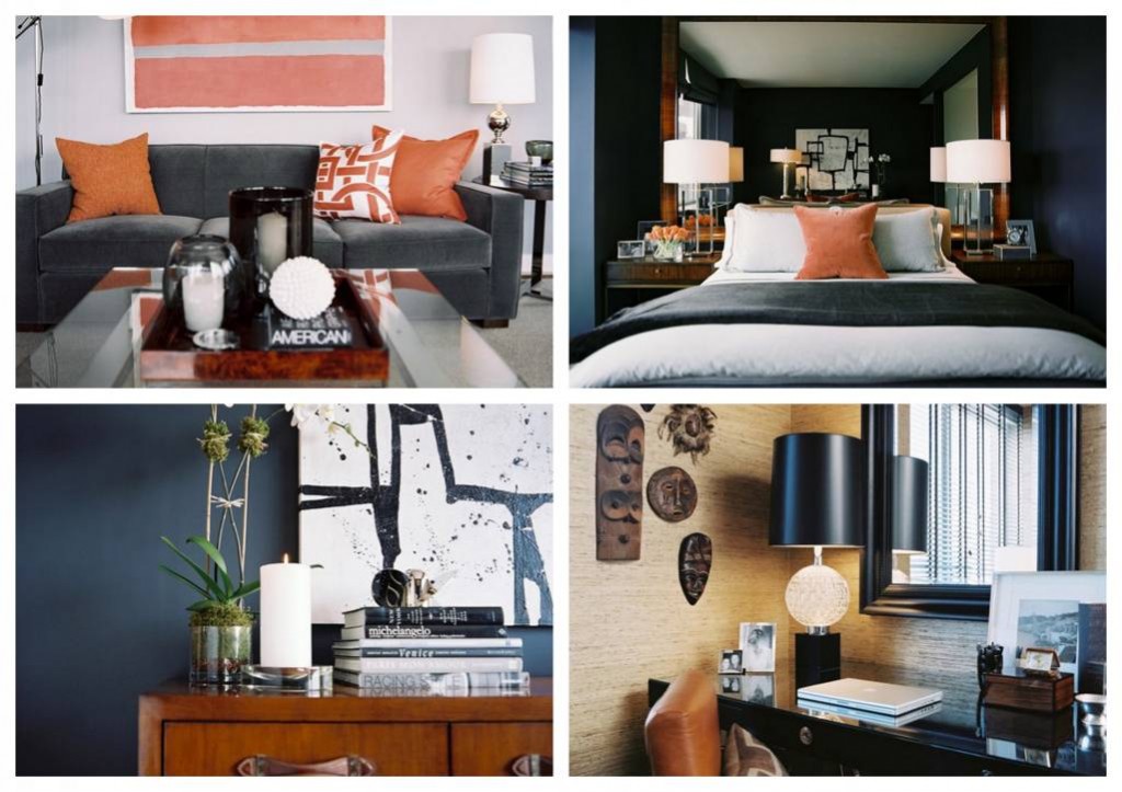
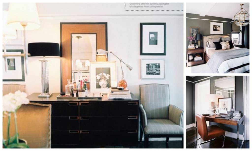
Then how do you define or distinguished masculine interior. It is mostly recognized by the straight lines, dark colors, metal structures and more glass elements. And there is no room for silk materials but all materials used in men’s interior are rigorous, robust and often raw material too.
Pic via; ronmarvin
When we again talking about masculine interior, we can see these commonly in variety of apartments than open houses. That is may be due to the fact that mostly bachelors choose apartments over open houses and also concern towards the compatibility.
Pic via; nytimes.com
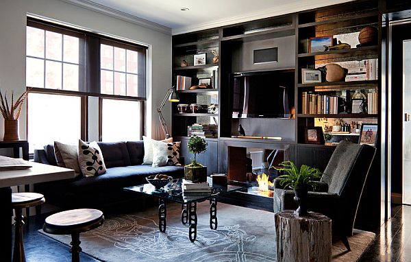
This is again an amazing apartment which belongs to a bachelor who wanted to have a super-luxury hotel, a place that would work for him in the short term as a stopover. The featured neutral tones, contrasts, black color, brutal textures and hi tech facilities are amazingly masculine.
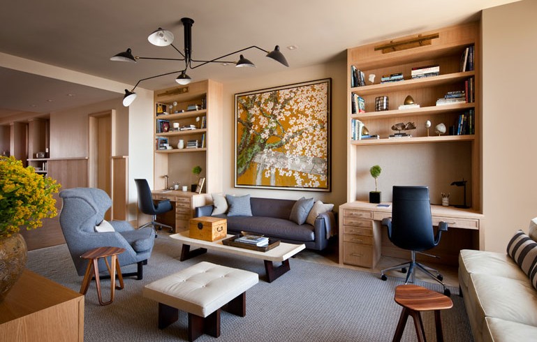
Pic via; shawnhenderson
Shawn Henderson another renowned designer thinks the beauty is in the details of lightness, flexibility and cleanliness. And he finds these in old materials furnishings by reclaiming in fresh new ways. His designs and selection of furniture are mostly pared down and more sleek while the back grounds stays with neutral and splash of colors.
Pic via; shawnhenderson

